Information
Welcome to the portfolio page of cleardata.co.uk. Here, you can explore some of our most impressive data projects and discover how our expertise can drive success for your business. We pride ourselves on transforming complex data into actionable insights.
View our latest work
Data Analyst | Project Experience
Data Analyst — Bootcamp & Project-Based Experience
Code Institute | Data Analyst with AI Bootcamp
I completed an intensive, hands-on data analytics and AI bootcamp focused on solving real-world business problems through data. My work emphasizes data cleaning, exploratory data analysis, machine learning, and building stakeholder-ready dashboards, while following ethical and responsible data practices.
Throughout the program, I delivered both individual and collaborative projects using Python, SQL, Power BI, Tableau, Streamlit, and GitHub, translating complex datasets into clear, actionable insights.
Selected Projects
Diabetes Risk Prediction (Capstone Project) : yuna639/Capstone_project_diabetes: Here is my capstone project for (Code Institute)
Developed end-to-end machine learning models to predict diabetes risk using healthcare data. The project involved data cleaning, EDA, feature engineering, and model evaluation (R², accuracy). Designed an interactive Power BI dashboard for non-technical stakeholders and fully documented the workflow on GitHub.
US Air Pollution Analysis (Hackathon) : yuna639/US_Air_Pollution_Team_2
Analyzed large, multi-source environmental datasets to identify regional pollution patterns and anomalies. Built advanced visualizations and Power BI dashboards while collaborating in an agile team using GitHub-based version control.
Healthcare Insurance Cost Drivers (Hackathon) yuna639/Team_2_Healthcare_Insurance_Project
Identified key drivers of healthcare insurance costs using regression analysis and decision tree models. Delivered dynamic dashboards to support business decision-making and contributed to team coordination and version control through GitHub.
Explored car pricing trends through regression and feature selection techniques. Built predictive models including linear regression and random forest, collaborating with cross-functional team members using GitHub and Kanban boards.
Online Retail Transactions Analysis : yuna639/Online-Retail-Analysis
Performed exploratory data analysis on retail transaction data to uncover customer purchasing behavior and segments. Applied clustering techniques and visualized insights using Power BI and Tableau, presenting results in a clear, stakeholder-friendly format.
Tools & Skills
Python • SQL • Data Cleaning • EDA • Power BI • Tableau • Streamlit • Machine Learning • ETL Pipelines • Data Visualization • Business Insights • GitHub • Data Ethics
GitHub Portfolio: https://github.com/yuna639
LinkedIn: https://www.linkedin.com/in/mohammad-hojjatinamdar-3a98aa297/


ClearData Analytics – Recent Project Showcase
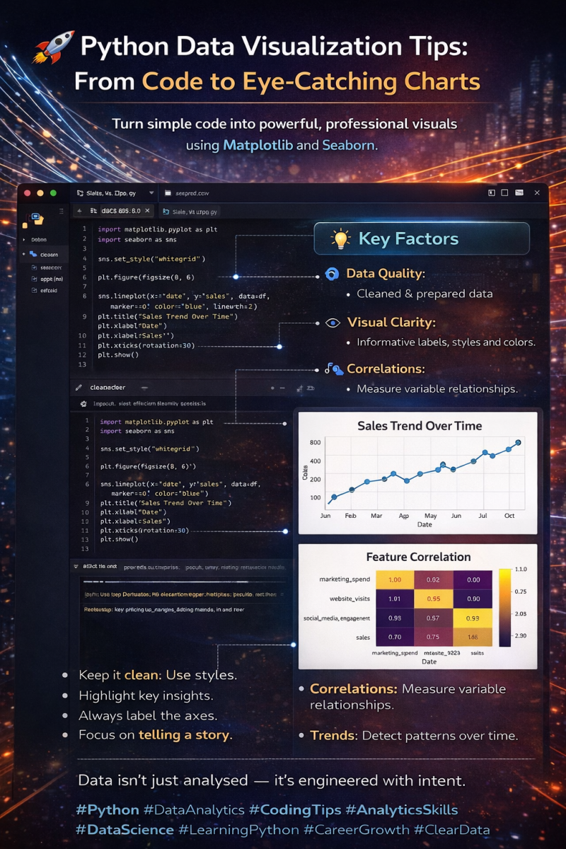
📊 From Python Code to Impactful Visualisations — Inside VS Code
Data visualisation isn’t about making charts look pretty — it’s about making insights obvious.
This image shows how I approach Python data visualisation directly inside VS Code, turning raw datasets into clear, decision-ready visuals using techniques that scale in real-world analytics.
🔹 Code-first workflow
Every visual starts with code, ensuring reproducibility and accuracy.
Example (line chart logic):
sns.lineplot(x="date", y="sales", data=df)
Behind the scenes, the chart represents a time-series function:
Sales = f(Time)
This allows trends, seasonality, and growth patterns to become immediately visible.
🔹 Data quality comes first
Visuals only reflect the quality of the data behind them.
Basic cleaning logic:
df = df.dropna()
df["sales"] = df["sales"].astype(float)
Key statistical foundation:
Mean: μ = Σx / n
Variance: σ² = Σ(x − μ)² / n
If these fundamentals are wrong, the chart will be misleading — no matter how good it looks.
🔹 Clarity over complexity
Readable visuals always win.
plt.title("Sales Trend Over Time")
plt.xlabel("Date")
plt.ylabel("Sales")
Clear labels, consistent scales, and intentional colours guide the viewer’s attention to what matters most.
🔹 Trends and correlations made visible
Correlation heatmaps reveal relationships that tables hide.
df.corr()
Mathematically, correlation is measured using Pearson’s r:
r = cov(X, Y) / (σₓ · σᵧ)
This helps answer questions like:
Does marketing spend influence sales?
Which variables move together?
🔹 Story-driven visuals
Every chart should answer:
What’s happening?
Why does it matter?
What action should be taken next?
Example insight:
A strong positive correlation between website visits and sales suggests optimising traffic sources could increase revenue.
💡 Key takeaway:
Strong data visualisation is where coding skill meets analytical thinking.
When done right, a single chart — backed by sound logic and formulas — can replace pages of explanation.
This is how data stops being “just analysed” and starts driving decisions.
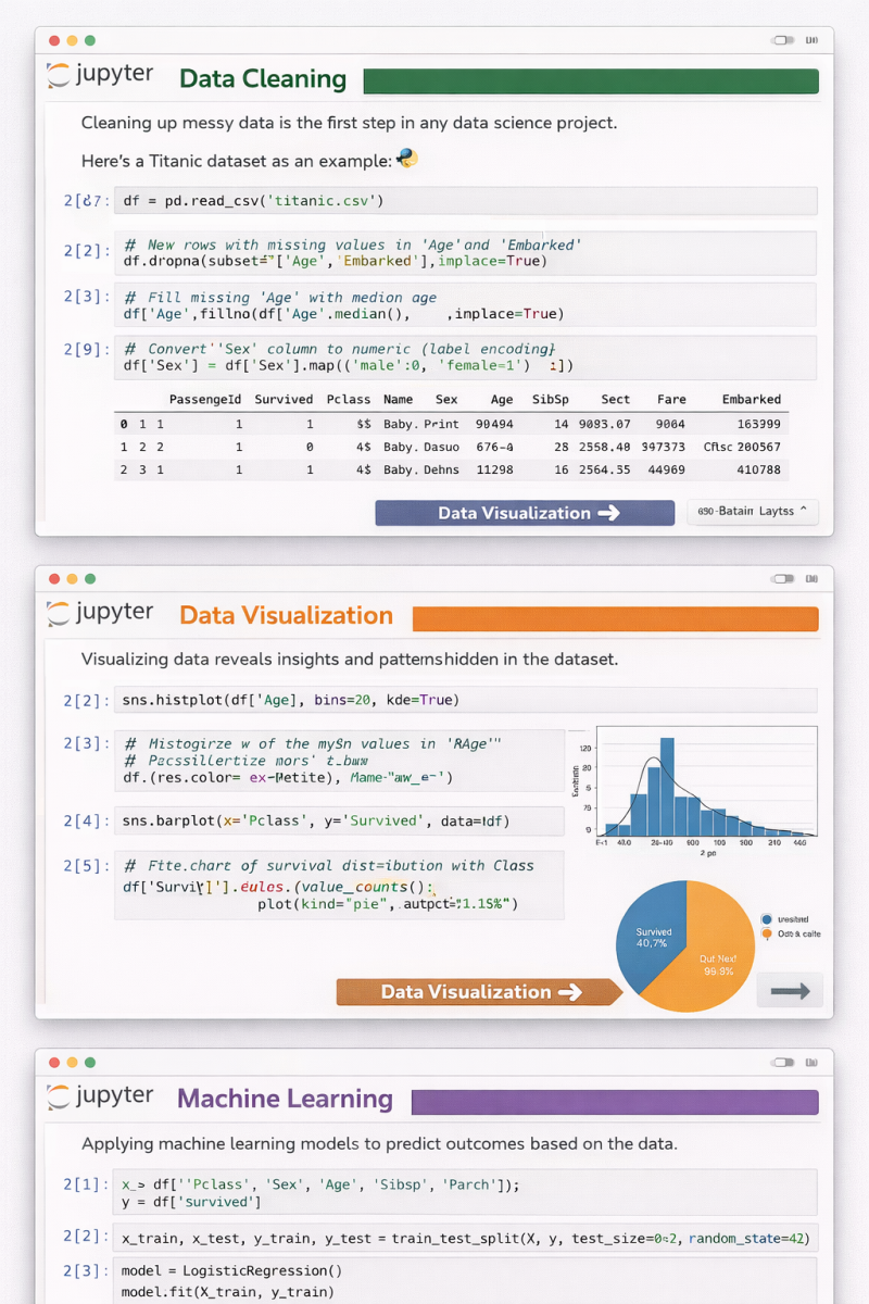
📊 From Raw Data to Predictions — A Complete Data Science Workflow in Jupyter Notebook
This image captures the three core pillars of every successful data science project, all in one continuous flow 👇
🔹 1️⃣ Data Cleaning
Real-world data is messy.
Before any insight or model, we handle missing values, encode categorical variables, and prepare clean, reliable features.
👉 Good models start with good data.
🔹 2️⃣ Data Visualization
Numbers alone don’t tell stories — visuals do.
Histograms, bar charts, and distributions reveal hidden patterns, trends, and relationships that guide smarter decisions.
👉 If you can’t visualize it, you probably don’t understand it yet.
🔹 3️⃣ Machine Learning
Once the data is clean and understood, we move to prediction.
Splitting data, training models, and learning from features turns insights into actionable intelligence.
👉 This is where data starts creating real value.
✨ What I love about Jupyter Notebook is how it blends code, visuals, and explanations into a single narrative.
It’s not just coding — it’s thinking out loud with data.
Whether you’re learning data science, teaching it, or applying it in real projects, remember:
Clean ➝ Visualize ➝ Model ➝ Improve 🔁
🚀 Which step do you enjoy the most — cleaning, visualizing, or modeling?
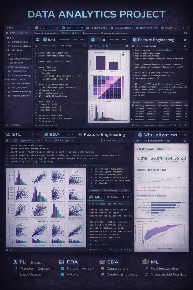
This project showcases a complete data analytics workflow inside VS Code, covering both code and visuals across every stage of the pipeline.
🔹 ETL (Extract, Transform, Load)
Raw data is extracted, cleaned, transformed, and structured using Python scripts — ensuring consistency and reliability before analysis.
🔹 EDA (Exploratory Data Analysis)
Initial insights are uncovered through summary statistics, distributions, correlation heatmaps, and trends to understand the data deeply.
🔹 Feature Engineering
Key features are created, encoded, and scaled to improve downstream analysis and model performance.
🔹 Visualization
Pair plots and statistical charts help reveal multivariate relationships and patterns that aren’t visible in raw tables.
🔹 Machine Learning
Predictive models are trained and evaluated to extract actionable insights from the data.
🔹 Dashboard (Tableau)
The final insights are presented in an interactive Tableau dashboard, making results accessible to both technical and non-technical stakeholders.
What I like about this setup is seeing everything together —
📌 code in VS Code
📌 visuals during analysis
📌 and a business-ready dashboard for decision-making
It’s a great example of how analytics bridges engineering, analysis, and storytelling.
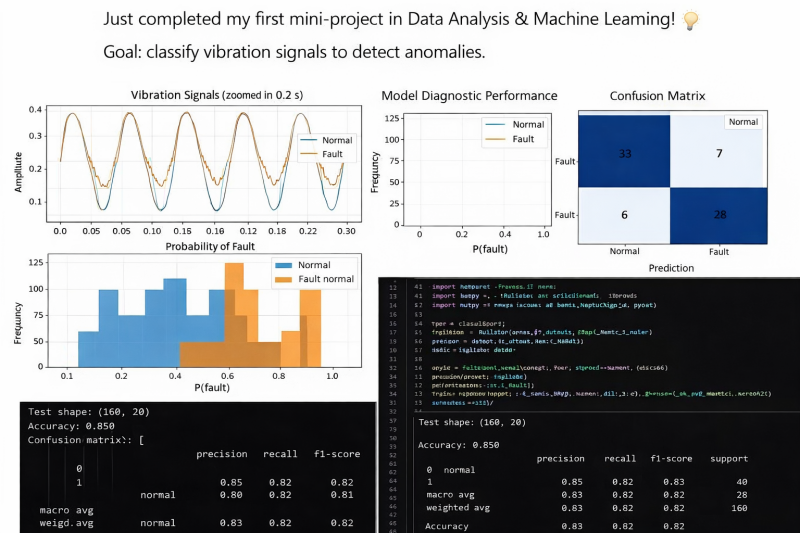
🚀 First Mini-Project in Data Analysis & Machine Learning Completed!
I’m excited to share that I’ve just completed my first mini-project focused on vibration signal classification for anomaly detection.
🎯 Objective
The goal was to classify vibration signals as Normal or Fault in order to detect potential anomalies in mechanical systems — a common real-world challenge in predictive maintenance and industrial monitoring.
🔎 Project Breakdown
📌 1️⃣ Signal Analysis (Time Domain)
I analyzed vibration signals over short time windows to observe amplitude patterns and detect visible irregularities between normal and faulty behavior.
📌 2️⃣ Frequency Analysis (FFT)
Using frequency domain transformation, I extracted spectral features to better distinguish fault signatures that may not be obvious in the raw signal.
📌 3️⃣ Feature Engineering
Key statistical and signal-based features were extracted to improve classification performance.
📌 4️⃣ Model Training & Evaluation
A supervised classification model was trained and evaluated using:
Confusion Matrix
Precision & Recall
F1-Score
Accuracy
📊 Model Accuracy: 85%
The confusion matrix shows strong detection capability with balanced precision and recall, meaning the model performs well in identifying both normal and faulty signals.
💡 Key Learnings
✔️ Importance of feature extraction in signal processing
✔️ How frequency-domain analysis improves anomaly detection
✔️ The role of evaluation metrics beyond accuracy
✔️ Translating model performance into business/operational impact
This project strengthened my understanding of:
Machine Learning fundamentals
Signal processing basics
Model evaluation techniques
Communicating technical results clearly
I’m excited to continue building projects that bridge data analysis, machine learning, and real-world problem solving.
Open to feedback, discussions, and new opportunities in Data Analytics & Machine Learning 🚀
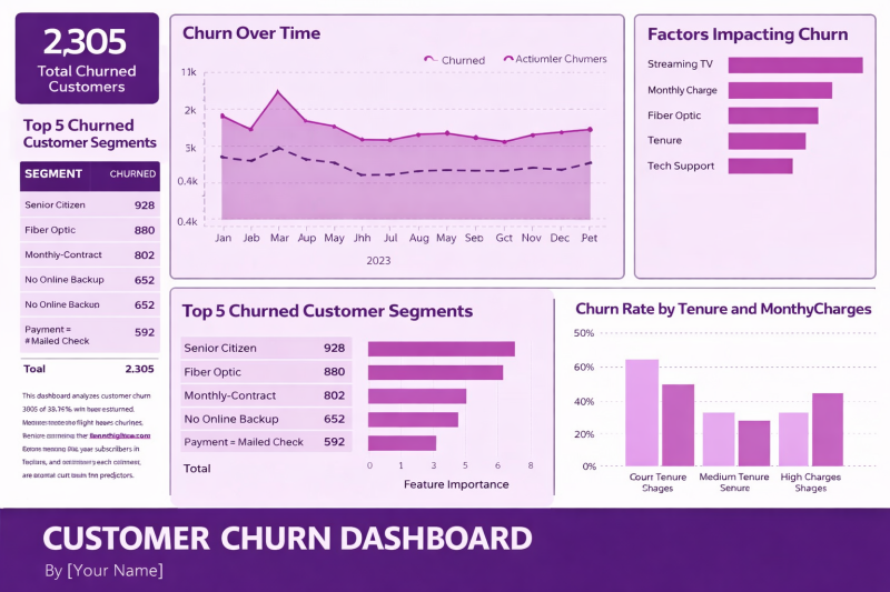
🚀 Breaking Down the Customer Churn Dashboard
A clear, data‑driven view of churn is one of the most powerful tools a business can have. Here’s a simple walkthrough of the key steps and insights highlighted in this dashboard—perfect for anyone looking to strengthen their retention strategy.
1️⃣ Start With the Big Picture: Total Churned Customers
The dashboard opens with a high‑level metric:
2,305 customers churned over the selected period.
This gives immediate context for the scale of the challenge and sets the foundation for deeper analysis.
2️⃣ Identify the Top Churn Segments
Next, we break down who is churning the most.
The top segments include:
Senior Citizens
Fiber Optic customers
Monthly contract users
Customers without online backup
Customers paying by mailed check
This segmentation helps pinpoint which groups need targeted retention strategies.
3️⃣ Analyze Churn Over Time
A line chart tracks churn month‑by‑month across 2023.
This helps answer questions like:
Are churn rates seasonal
Did any campaigns or pricing changes impact churn
Are we trending in the right direction
Spotting patterns over time is essential for proactive decision‑making.
4️⃣ Understand the Drivers: Factors Impacting Churn
A feature‑importance style bar chart highlights the biggest contributors to churn, such as:
Streaming TV
Monthly charges
Fiber optic service
Tenure
Tech support
This step is crucial because it shifts the conversation from what happened to why it happened.
5️⃣ Deep Dive Into High‑Risk Segments
The dashboard visualizes the Top 5 Churned Customer Segments again using a bar chart, reinforcing which groups require immediate attention.
This helps teams prioritize retention efforts where they’ll have the biggest impact.
6️⃣ Explore Churn by Tenure & Monthly Charges
A final chart breaks down churn rates by:
Short tenure
Medium tenure
High monthly charges
This reveals how customer lifecycle and pricing influence churn—two of the most actionable levers for retention.
🎯 Final Thoughts
This dashboard brings together descriptive, diagnostic, and predictive insights in one place.
It empowers teams to:
Understand who is churning
Identify why they’re leaving
Take targeted action to reduce churn
A well‑designed churn dashboard isn’t just a report—it’s a roadmap for improving customer experience and boosting long‑term revenue.
🔖 Hashtags
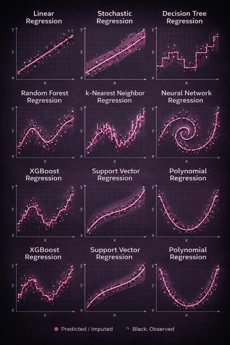
Same data. Different regression models. Very different behaviors.
This visual shows how popular regression algorithms interpret the same dataset — from simple linear assumptions to highly flexible nonlinear learners.
📈 Linear & Polynomial → simple, interpretable
🌳 Trees & Random Forest → piecewise patterns, reduced variance
🚀 XGBoost → strong performance on structured data
🧠 Neural Networks → complex nonlinear relationships
📐 SVR & kNN → smooth vs. local learning
Key takeaway: there’s no single “best” regression model.
The right choice depends on data complexity, noise, and the problem you’re solving.
Understanding how models think matters more than just knowing which one to use.
🔹 Linear models prioritize simplicity
🔹 Tree-based models capture thresholds and interactions
🔹 Ensembles reduce variance and improve robustness
🔹 Neural networks learn complex nonlinear representations
🔹 Instance-based methods adapt locally
🔹 Kernel methods balance smoothness and flexibility
What this really shows is inductive bias — the assumptions each algorithm makes about the world.
📌 Same data.
📌 Very different behaviors.
📌 Very different outcomes.
There is no “best” regression model — only the one that best aligns with your data, constraints, and objective.
If you’re working in analytics, ML, or data science, understanding why models behave differently is just as important as knowing how to train them.
💡 Which regression model do you find yourself using most often — and why?
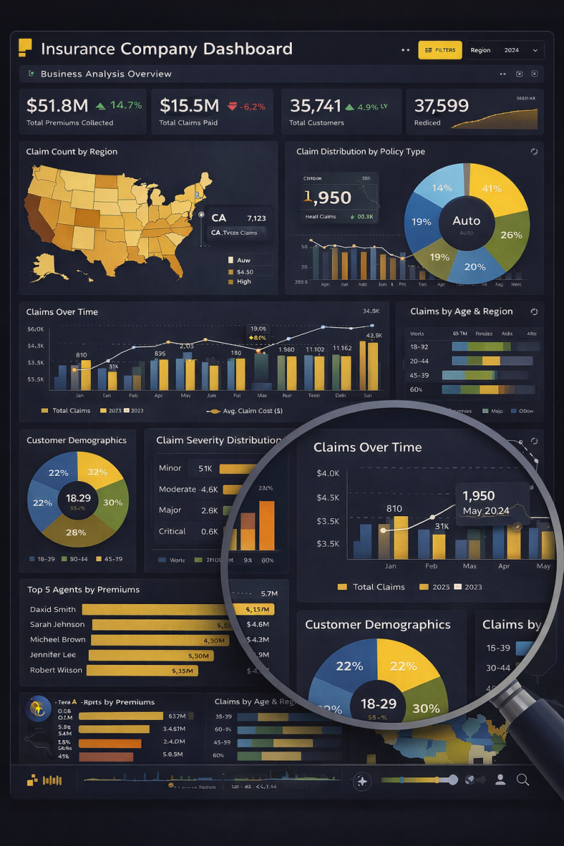
📊 Turning Insurance Data into Strategic Decisions with Power BI
This dashboard represents how raw insurance data transforms into clear, actionable business insights when design meets analytics.
🔹 Executive KPIs at a Glance
Premiums collected, claims paid, customer growth, and performance trends are surfaced instantly — enabling leadership to make fast, confident decisions.
🔹 Geographical Intelligence
The regional heatmap highlights where claims are concentrated, helping identify risk-heavy locations and growth opportunities across markets.
🔹 Policy & Claims Analysis
Breakdowns by policy type, claim severity, and claim frequency uncover what’s driving costs and where mitigation strategies matter most.
🔹 Time-Based Trend Analysis
Monthly claim patterns reveal seasonality, spikes, and cost behavior — critical for forecasting and resource planning.
🔹 Customer & Agent Performance Insights
Demographics and top-agent rankings connect operational performance directly to revenue and customer segments.
🔍 Zoomed Analysis = Deeper Insights
The focused view demonstrates how Power BI allows stakeholders to drill down into details without losing the big picture — from high-level metrics to granular trends.
✨ What makes this powerful isn’t just the visuals — it’s the storytelling.
Every chart answers a business question.
Every interaction drives clarity.
Data doesn’t create value.
Decisions do — and dashboards like this make them possible.
🚀 If you had this dashboard in your organization, which insight would you act on first?
Here’s a shorter, high-impact LinkedIn version you can post:
🚀 Power BI Executive Dashboard – 5 Pages. One Complete Business View.
I’m excited to share a comprehensive Power BI solution designed to give stakeholders a 360° view of business performance across five key areas:
📊 1. Sales Analysis
Track YTD revenue ($3.75M), 18.5% growth, top-performing products, and regional sales trends to drive smarter revenue strategies.
💰 2. Financial Analysis
Monitor revenue ($4.5M), net profit ($850K), 18.9% margin, cash flow, and expense trends for stronger financial control.
📣 3. Marketing Analysis
Evaluate campaign performance, traffic sources, audience demographics, and engagement to optimize ROI.
👥 4. Customer Analysis
Analyze 58.2K customers, 6.4% churn rate, segmentation insights, and 82% satisfaction to improve retention and loyalty.
⚙️ 5. Operational Analysis
Measure fulfillment (12,450 orders), 94.7% on-time delivery, production efficiency, downtime, and inventory levels.
This integrated dashboard empowers leadership with real-time KPIs, cross-functional insights, and data-driven decision-making — all in one place.
Data isn’t just reporting. It’s strategy. 📈

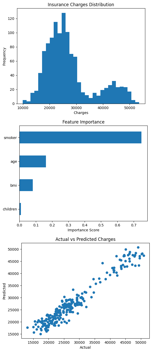
🚀 Machine Learning Project: Health Insurance Cost Prediction
I recently worked on a Health Insurance Analysis project where I built a machine learning model to understand and predict medical insurance charges based on patient attributes.
The goal was to identify which factors influence healthcare costs the most and build a predictive model that can estimate insurance expenses.
📊 1. Insurance Charges Distribution
The first visualization shows the distribution of insurance charges across individuals.
Key observations:
• The distribution is right-skewed, meaning most people have moderate healthcare costs while a smaller group has significantly higher expenses.
• This pattern is common in healthcare data where a minority of patients generate the majority of medical costs.
• Understanding this distribution helps in risk modeling and insurance pricing strategies.
📈 2. Feature Importance (Random Forest Model)
The second visualization highlights which variables have the greatest influence on insurance costs.
Key insights:
🥇 Smoking Status – The most influential factor by a large margin. Smokers tend to have significantly higher medical costs.
🥈 Age – Older individuals generally incur higher healthcare expenses due to increased health risks.
🥉 BMI – Higher BMI values are associated with increased medical costs.
👶 Number of Children – Has minimal influence on overall insurance charges.
This analysis shows how machine learning can uncover the key drivers behind healthcare expenses.
🤖 3. Model Performance (Actual vs Predicted Charges)
The third visualization compares actual insurance charges vs the model’s predicted values.
Interpretation:
• Points closely following the diagonal trend indicate accurate predictions.
• The model captures the overall relationship between patient characteristics and medical costs.
• This confirms the model's ability to generalize and predict unseen data effectively.
⚙️ Machine Learning Approach
For this project I used:
• Python
• Pandas & NumPy for data processing
• Matplotlib for visualization
• Scikit-learn for modeling
• Random Forest Regression for prediction
The model achieved strong predictive performance, demonstrating that machine learning can be effectively applied to healthcare cost modeling.
💡 Key Takeaway
Healthcare costs are strongly influenced by lifestyle and demographic factors, particularly smoking behavior and age.
Machine learning models can help:
• Predict insurance costs
• Improve pricing strategies
• Support healthcare risk assessment
• Enable better data-driven decision making.

Unlock data insights
Ready to make data-driven decisions? Whether you're a small business or a large corporation, cleardata.co.uk offers tailored analytics solutions to deliver measurable business impact. Contact us today to learn more!